Nice style, though I find myself questioning the consistency of your work. Some are really nice, some look like you kind of threw it together really quickly.
1. Nice flow and colors on it, I actually like it a lot. The fact that the only reason the focal stands out at all is the contrast in the vibrancy of color bugs me though.
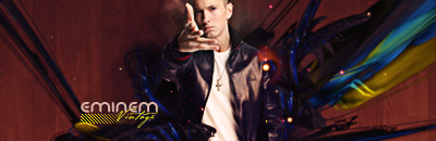
2. You have a bunch of random lines running around (halfway up, horizontally, and a diagonal one on the right), as well as blatantly obvious displacement mapping on the right that doesn't do anything for the sig at all. It makes it look sloppy. You also could have done without the "SAKLHFSJKFHJK" behind the actually decipherable text, it just looks silly. However, this is probably one of the better ones when all is said and done - I really like the blue, has nice depth, and the effects were implemented reasonably well.
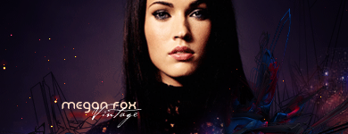
3. My favorite of the bunch, you probably have it as your forum sig atm for a reason. Colorful, but not overwhelmingly so. Great depth, and good integration of the focal.
4. The style's not my forte, don't wanna say anything about this one.
5. This is what I mean by inconsistency in quality (I'm going to take a guess and say this was one of your earlier ones, though). The render looks pasted on, and the lighting does almost nothing. Looks beginner-y. Sorry.
6. Looks like you have a background, a thrown in C4D and (blurry) render. Doesn't showcase any real ability.
7. It's iight.
Overall, your good ones show that you're improving. Keep at it!